The New York Public Library (NYPL) system engaged TPG’s Branding Studio to create a set of brand guidelines for their new interior signage standards across all of their locations. The NYPL needed a wayfinding strategy that would not only help guests better navigate through their spaces but would help the overall library system be more efficient. The goal was to create a holistic approach of standardizing their signage to communicate wayfinding and celebrate and reinforce the legacy of NYPL across all their different branches.
TPG’s Branding Studio first completed a comprehensive discovery phase to better understand the NYPL’s brand and culture. The team completed site visits of the library’s various branches to view their existing signage and observe the different end-users. By studying the various demographics, how they use the public library services and the time spent in the environment, our team recognized that the library system had many diverse needs that had to be addressed in this branding program.
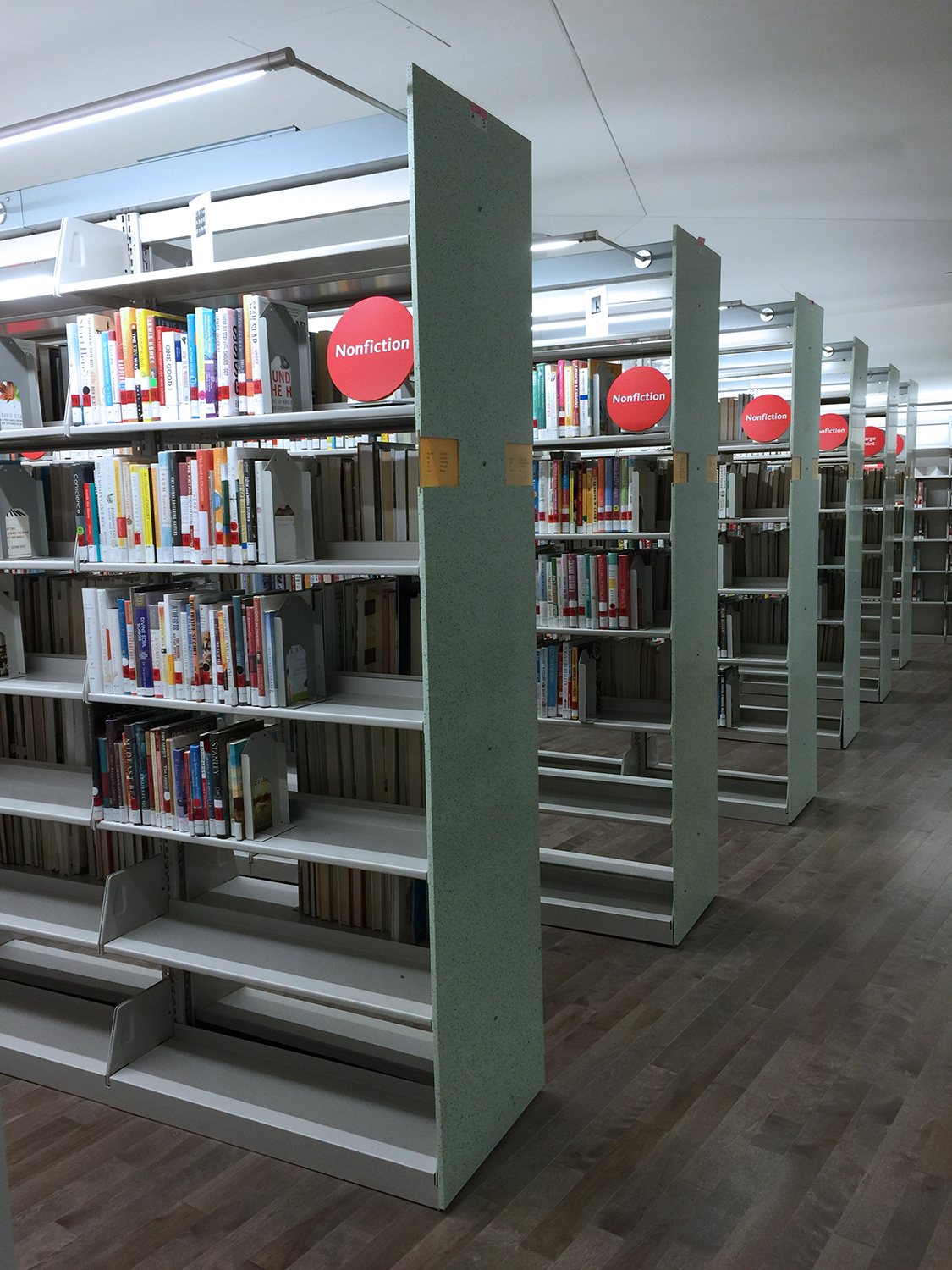
After reviewing all the branch locations with the client, three signature palette options were created to unify the signage system and accommodate the various branch types across the boroughs. For each palette, the team created a custom menu of visual cues, including navigational signage, bathroom signage, and signage illustrating book collections and features. These palettes are intended to carry out the brand with similar layouts and finishes in order to present a cohesive graphic solution. This massive program helps the end-user to navigate each of their spaces with ease, ultimately improving the overall library experience.
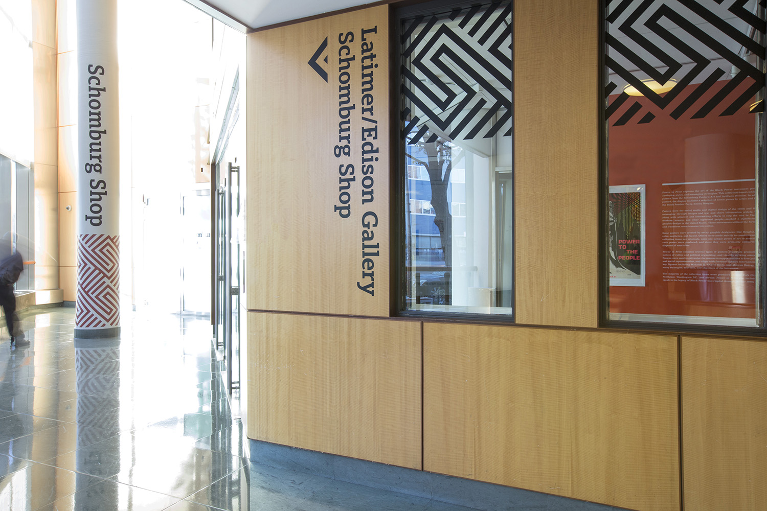
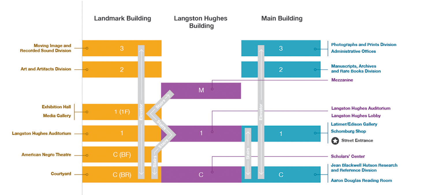
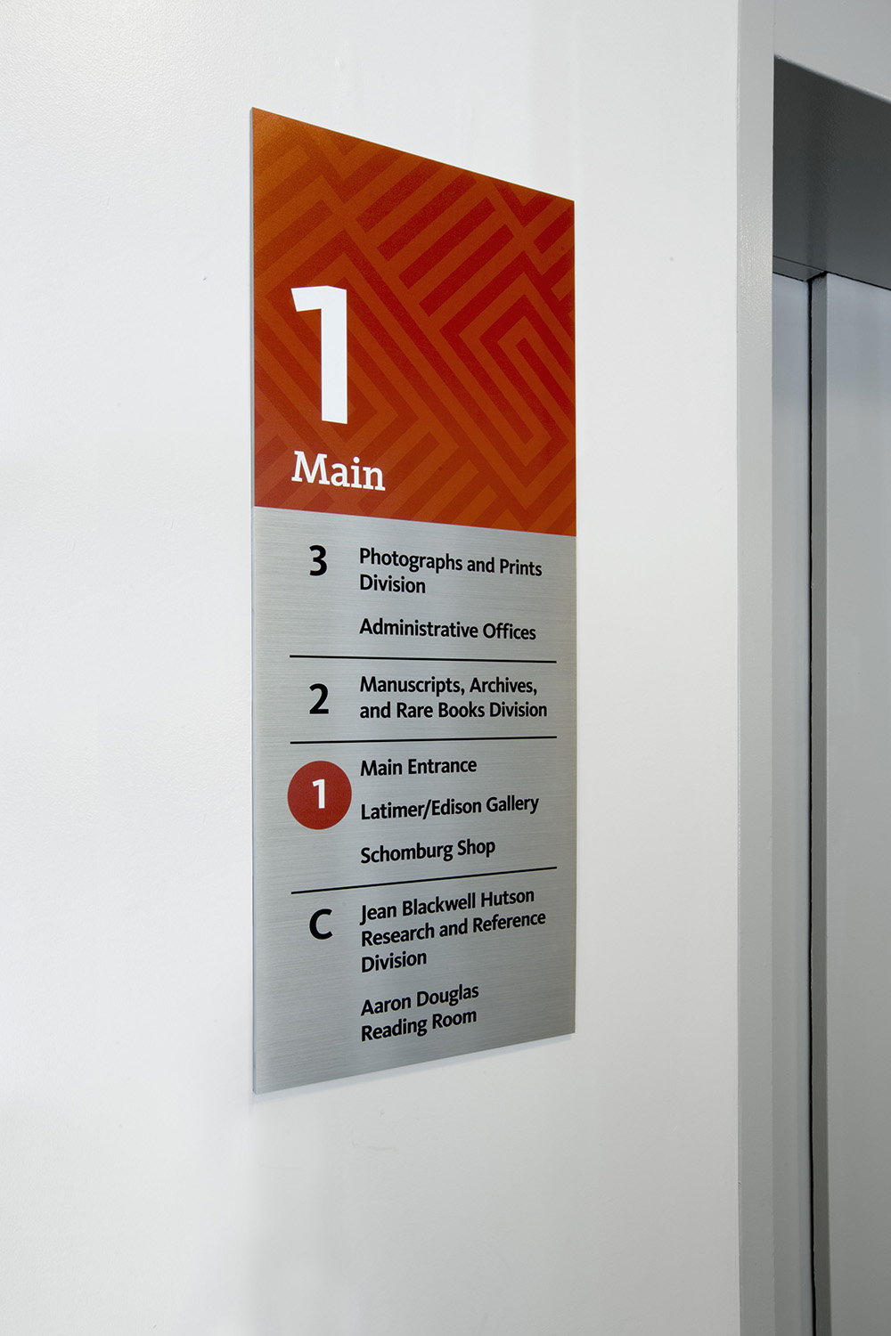
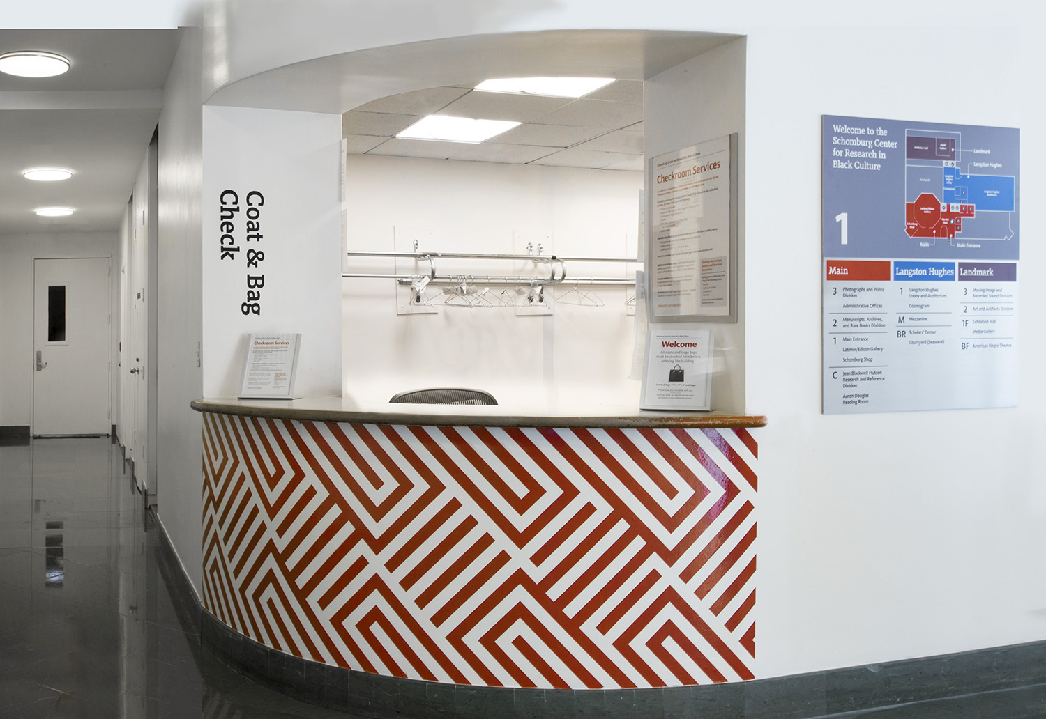
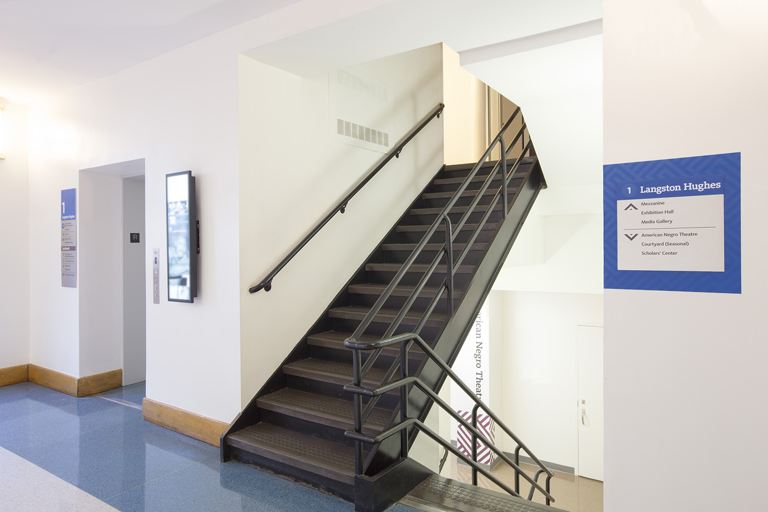
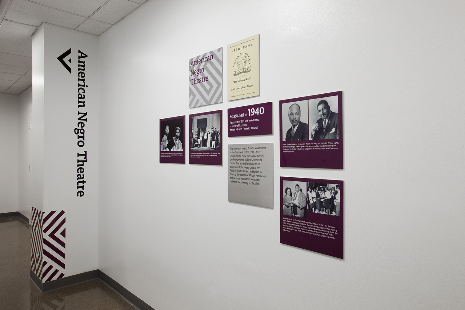
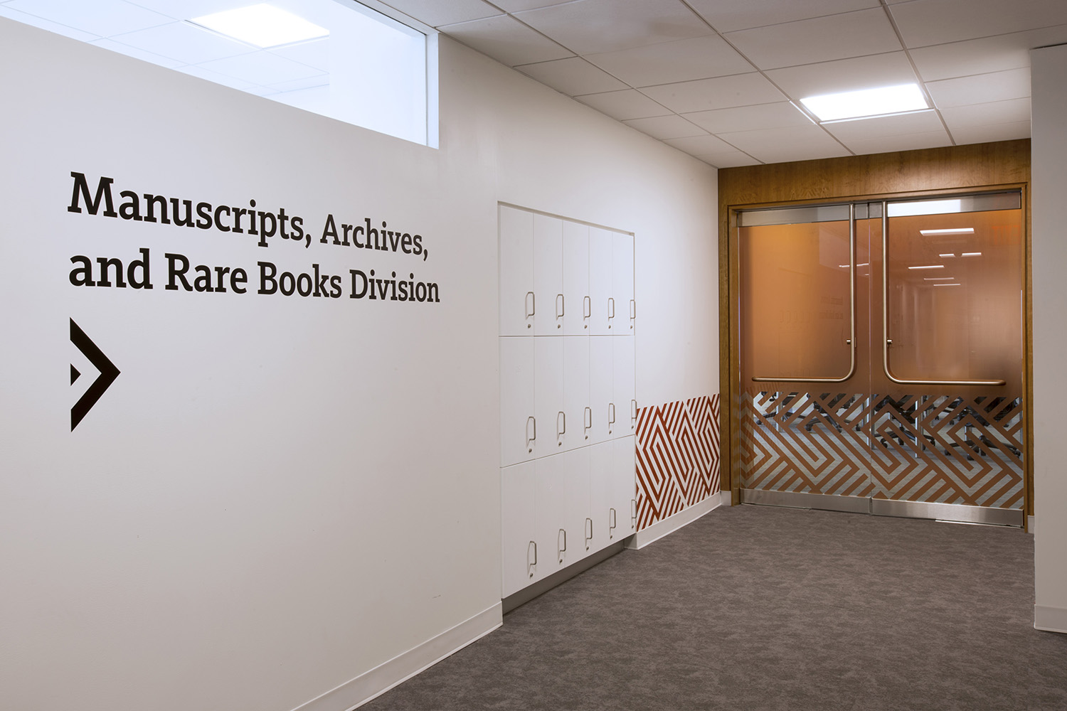
After our firm's success with this project, we were brought back to establish a unique wayfinding system for NYPL’s, The Schomburg Center for Research in Black Culture. Located in Harlem, the Center is a research library and archive repository of materials that represent the history and culture of people of African descent. The Center consists of three connected buildings, and the Graphics Studio incorporated a color strategy and graphics to help with wayfinding between them in order to eliminate a physical brochure map. They also used large-scale wall graphics, endpoint signs, and elevator directories to assist with visual cues.

